The Persistence of Vision
I've been totally blind for almost forty-one years. Last week, I designed a monogram for an Italian fashion house.
Not an AI-generated logo. I designed the shape myself, down to the precise relationship between the two letters. The only thing I asked AI for was advice about an Italian blue.
Let me explain.
LULU TOM is a fictional Italian fashion house in the CharliVerse, my growing world of characters, companies, stories and creative practices. Its designer is Ludovica Tommasi, known as Lulu Tom. She designs clothes, including dresses and foundation garments, and now her house has a visual identity.
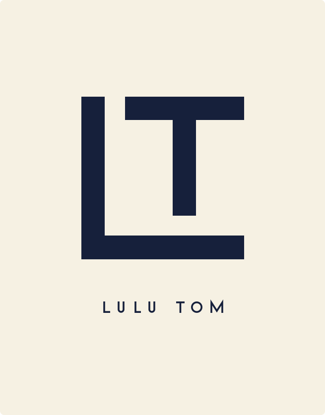
The monogram consists of two capital letters, L and T.
The L forms the outside structure. Its vertical stroke runs down the left, and its horizontal foot extends across the bottom. The T sits within that structure, its crossbar extending towards the right, its vertical stroke descending but stopping short of the L's foot.
That gap matters. The letters are together, but they don't merge. The whole thing is geometric, constructed from straight lines of consistent thickness.
I knew exactly how I wanted those letters to fit together.
AI helped turn the design into an SVG, a vector image made from code. It can be scaled up or down without losing its shape. Beneath the monogram sits LULU TOM in widely spaced, fine capital letters.
For the colour, I asked about an Italian blue. We settled on a deep midnight blue against a warm ivory background.
And there it is. The LULU TOM monogram.
But how does a blind person design something visual?
By designing it.
That might sound flippant, but I think it's the important part.
I can understand a straight line. I can understand a right angle, relative position, proportion, symmetry and negative space. I can decide that one line should stop before it meets another. None of those decisions requires me to see the finished image.
What I need is a way to express them and a way to check that what has been produced corresponds to what I intended.
Code gives me the first. AI descriptions help with the second.
This is part of what I've been exploring through Blind Drawing School, a project within Blind Ant, my design fiction practice. The idea is that a blind person can create visual work through instructions, geometry, code and feedback rather than by manipulating marks on a screen.
The computer draws. I design.
Of course, there are things I cannot independently judge. I cannot look at the finished logo and decide whether it is beautiful. I have to rely on descriptions, comparisons, criticism and other people's responses.
But sighted designers rely on other people's responses too. The difference is in how we access the work, not necessarily in who makes the decisions.
The persistence of vision
The title is deliberate.
Vision is usually understood as something that happens through the eyes. But there is another sense of the word: having an idea of something that does not yet exist, understanding how its parts should fit together, and working to bring it into being.
I lost my sight in 1985.
I didn't lose my ability to think spatially, imagine arrangements, make aesthetic choices or develop a visual language.
For much of the intervening forty years, there was a practical problem. Having an idea for an image and being able to produce it were two quite different things.
Now that distance is shrinking.
And perhaps the most interesting thing about the LULU TOM monogram is that I wasn't trying to demonstrate anything about blindness or accessibility.
I was working on my fictional fashion house. It needed a logo. I had an idea for one, so I made it.
The accessibility story emerged afterwards.
That's the persistence of vision.
Forty years without sight, and I still know exactly where I want the T to sit inside the L.